The Story Behind The Rebrand
The PCN logo unveiled today is the third in our company’s history. With all the changes in the technology we manage, the business we have built, and the customers we serve, it is time for a change.
Our primary goal for the rebranding was to create a modern look and feel reflective of the modern offerings and architecture we bring to market. Significant private equity activity in the DDI space in recent years has raised the marketing bar and we, as owner-operators, are evolving to keep pace. Secondarily, we wanted to mark the dawn of our post-COVID chapter. PCN is coming out of this challenging time stronger with a talented and dedicated team. This new chapter also marks James Nutt becoming an equity partner in the business. We are excited about the dynamic markets we serve and are energized by the opportunities we see for growth under the banner of our new brand.
Let’s take a look back at prior PCN logos before sharing some of the creative thinking that went into the new logo design. PCN’s red, yellow, and blue “Swoosh” logo was created in 1999. We released the PCN “Stripes” logo in August 2010 with the tagline “Technical Expertise. Tangible Results. In 2019, we updated our tagline to “True Partners in Change.”
“SWOOSH”
1999
“STRIPE”
2010
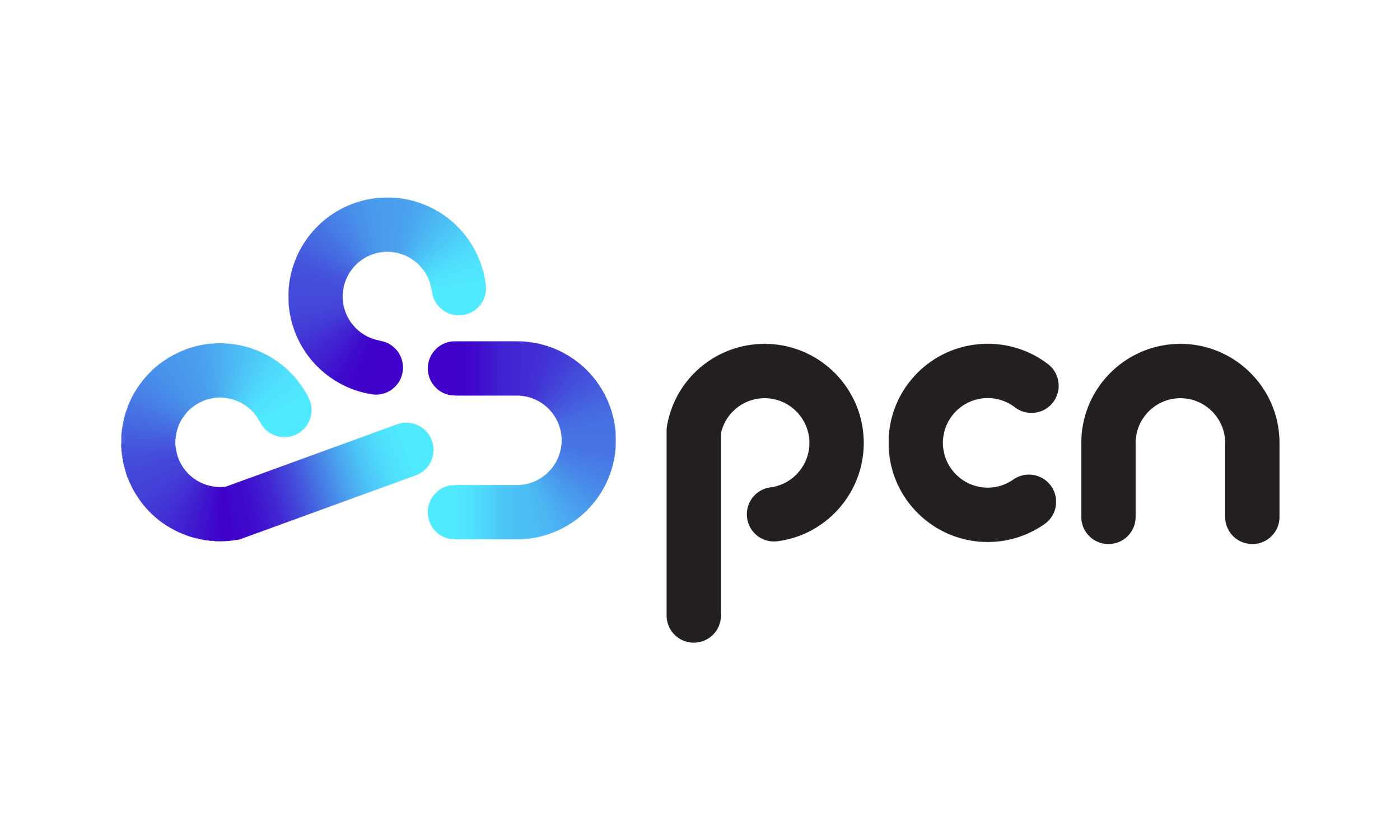
Today, we are proud to present the PCN “Cloud” logo.
CLOUD – 2024
To kick off this rebranding initiative, PCN retained Visuable, a London-based woman-owned agency in November 2023, after interviewing a half-dozen potential providers.
After conducting a market assessment, we collaborated as partners to create a new visual identity and messaging, complete with logo, website, and graphic redesigns for a modern aesthetic and direction for PCN’s brand. The fresh look and feel features clean and simplified color pallete, typography, and graphics
Lidia Drzewiecka, the Founder & Creative Director of Visuable [www.visuable.co ] shares her perspective on the thinking behind PCN’s brand transformation:
“At Visuable, we were excited to assist PCN in evolving their brand identity to establish themselves as leaders in simplified DDI management, delivered directly from the cloud to their customers. Our market analysis showed that while many organizations in the DDI sector emphasize security and reliability, none had positioned themselves as leaders in cloud-based DDI innovation focused on simplification. This finding presented the precise market opportunity we sought to help PCN differentiate themselves and effectively communicate the true value of their offerings.
For the logo design, we chose a symbol that evokes the cloud, subtly incorporating the 'PCN' letters to signify that their technology is cloud based. The brand color palette merges shades of blue and purple, blending the stability of blue with the creativity of purple. This combination reflects a dynamic yet balanced image, ideal for brands aiming to project both innovation and reliability."
PCN believes the PCN Cloud logo’s modern, fresh, and dynamic look will resonate with our customers, prospects and partners. It reflects our brand’s core positioning of “simplicity” while conveying a friendly accessible open feel. The three stripes in our former logo have been replaced by a stylized cloud made of the three letters of our name, each having gradient transitions from a bright aqua/cyan to a bold purple/violet. This gradient evokes a feeling of fluidity and changeability, like the environments our tools and team manage for customers. The letters that make up the new symbol are in motion and dynamic, interconnected and modular. The curve in the Stripe logo is reflected in the curve of the new lettering and Cloud symbol. The new symbol itself evokes cloud and cloud-friendly, like our offerings and our customers infrastructures, and the “p” provides oomph, motion, and lift. The shift from upper case to lower case reflects our role as part of a bigger ecosystem, smoothly integrating with many other parts.
Our new visual identity is energized, simple, and prepared for change.
“Understanding DDI can be complex, a challenge we ourselves faced initially. This is precisely why we aligned PCN's messaging with their very mission to simplify DDI, through a collaborative approach that includes partnering with clients, supporting their journey, and providing direct implementation support with their seasoned in-house DDI experts and innovative flex support model” says Lidia from Visuable.
We are retaining “True Partners in Change” as our tag line. Our brand identity is deeply rooted in partnership, adaptability, and a commitment to facilitating transformative experiences for clients. “True Partners in Change” speaks to the heart of PCN’s mission – not just providing a service or technology but being a trusted partner guiding clients through the ever-evolving dynamic landscape of digital infrastructure.
"When it comes to designing the website, our aim was to create a clean and modern aesthetic with a straightforward and intuitive menu, placing the brand message prominently. We noticed that many competitors in the DDI space overcomplicate their site navigation, that can lead to confusing and overwhelming users. By focusing on simplification, our goal was to distinguish PCN with easy-to-navigate website design and a clear, user-friendly experience, further reinforcing the key brand message” explains Lidia.
Wrap Up
PCN is excited to begin building commercial capabilities commensurate with our technical capabilities. How we market and sell is critical to broaden the impact and reach of our technical capabilities in both the commercial and public sectors. We look forward to taking up our game as we continue to focus on and invest in these aspects of our business.
About PCN
PCN, a certified woman owned business enterprise (WBE), is a recognized global leader in Managed DNS, DHCP, and IPAM (MDDI). PCN’s ClearSky™ is an industry-leading DDI as a Service (DDIaaS) solution that delivers and manages scalable, resilient, and secure DDI solutions. Our tech-enabled services support the commercial and public sectors with proven tools, process, and governance that ensure SLAs are met and service management is seamless. In addition to DDI related services, PCN also offers Staffing, Service Desk and Security-GRC (SSDS) services both through prime partners and direct to government and corporate entities committed to diversifying supply chain spend.


